Top Color Combinations & Schemes for 2026
Color is one of the most powerful tools in modern web design. It influences how users feel, how they navigate a digital interface, and how they interpret the personality of a brand. Effective use of color can improve readability, highlight key actions, guide user flow, and create an emotional connection between the product and its audience. When colors are chosen intentionally, they enhance clarity and help users understand information faster. When they’re chosen poorly, even a well-structured design can feel chaotic or confusing.
Design leaders at Figma emphasize that color is not just decoration – it is a functional component that shapes overall user experience and defines the tone of a digital product. The right palette supports accessibility, creates visual hierarchy, and strengthens brand identity. As we move into 2026, these principles matter more than ever. Digital products are becoming more immersive, more personalized, and more visually expressive, which means the role of color continues to grow.
At Codeska, our design team has analyzed evolving visual trends, color psychology insights, and Figma’s curated collection of contemporary palettes. Based on this research, we’ve selected the top color schemes for 2026 – combinations that feel modern, accessible, and future-ready. In this article, we’ll break down essential color theory, explore our favorite palettes of the year, and share practical guidelines for choosing the right colors for your next website or interface.
Color Harmony Theory Basics
To understand how to build strong, intentional color palettes, it helps to start with the foundation of modern color theory: the color wheel. This circular diagram visualizes the relationships between colors and serves as a practical tool for designers. The concept dates back to the 17th century, when Sir Isaac Newton arranged colors in a continuous spectrum, forming the first version of the wheel. Today, designers still use his structure, divided into primary colors (red, yellow, blue), secondary colors (green, orange, violet), and tertiary colors, which are created by mixing adjacent hues.
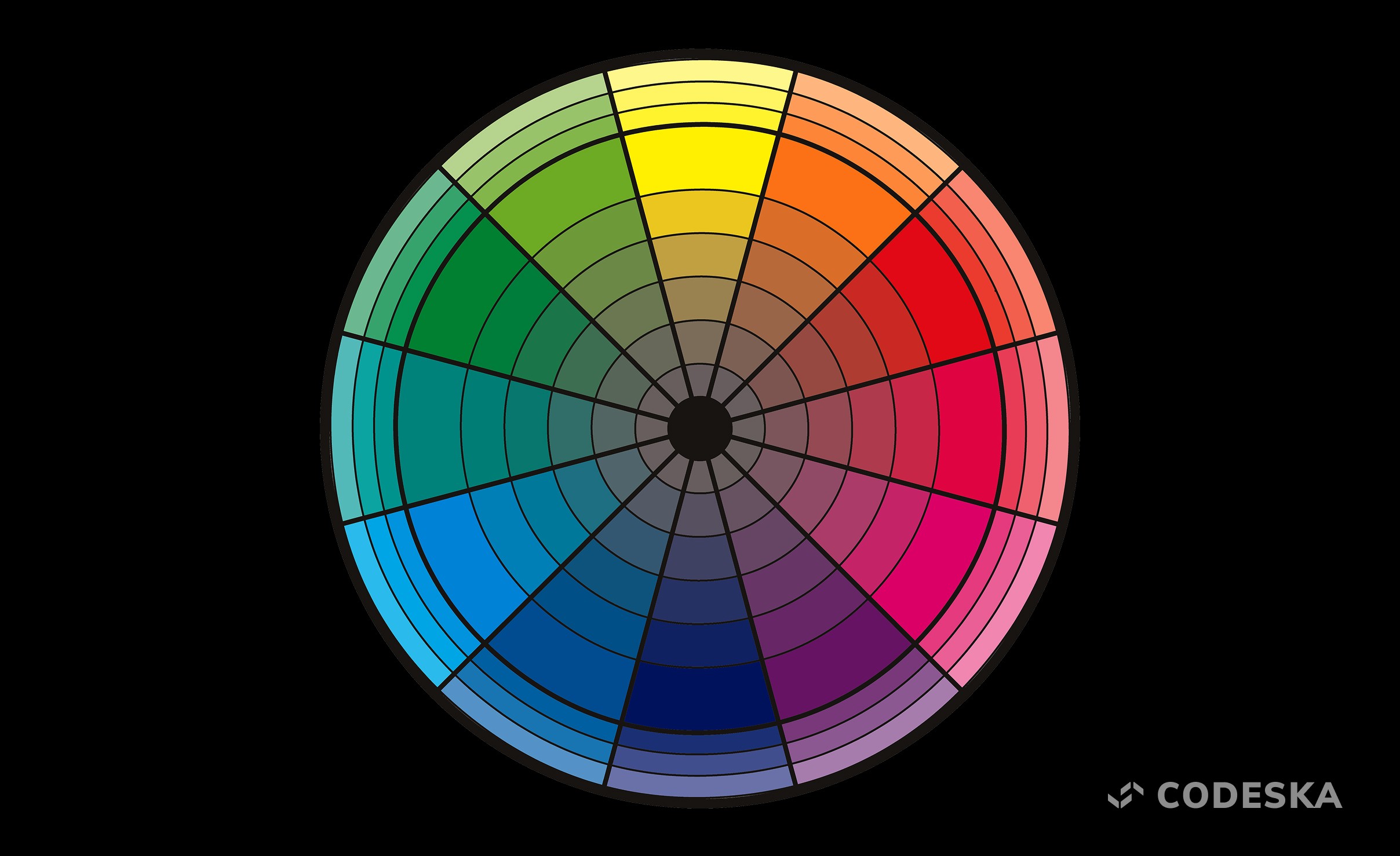
The color wheel is valuable because it shows how colors interact with one another. For example, analogous colors—those that sit next to each other—naturally blend and create smooth, harmonious transitions. Complementary colors, which sit directly opposite on the wheel, produce strong, dynamic contrast that instantly attracts attention. Understanding these relationships helps designers intentionally shape the emotional tone of a product and decide how bold or subtle a palette should feel.
From these interactions emerges the concept of color harmony. Harmony is what makes a palette feel balanced, cohesive, and visually pleasing. When colors are in harmony, they work together rather than compete for attention. This balance is essential in digital design because harmonious palettes support readability, create visual hierarchy, and reinforce a clear identity throughout an interface. A well-harmonized palette can subtly guide the user’s eye to key elements like call-to-action buttons, forms, or content blocks.
Designers often rely on several classic harmony models:
Monochromatic palettes use variations of a single hue, creating an elegant, minimalistic look.
Analogous palettes feel natural and calming, thanks to their smooth transitions.
Complementary and split-complementary palettes offer stronger contrast, making them ideal for highlighting interactive elements.
Triadic and tetradic schemes introduce multiple hues without losing balance, offering a more playful or expressive aesthetic.
By combining these harmony principles with an understanding of color meaning and brand personality, you can create palettes that are not only attractive but also functional and emotionally resonant. A well-built palette improves navigation, supports accessibility, and ensures the overall design feels intentional, professional, and aligned with the message your brand wants to communicate.
Top Color Combinations for 2026
As visual trends evolve, color continues to play one of the most influential roles in shaping how users perceive digital products. In 2026, we’re seeing a shift toward palettes that combine emotional richness with functional clarity — colors that not only look beautiful but also help interfaces feel intuitive, accessible, and modern. Brands are becoming more expressive, users expect more personalization, and digital products are leaning into palettes that evoke confidence, calm, energy, or nostalgia depending on their purpose.
To help designers, founders, and product teams navigate this landscape, our team reviewed dozens of palettes from Figma’s Resource Library — one of the most trusted hubs for contemporary design inspiration. From this extensive collection, we selected standout color combinations that represent the strongest visual directions for 2026.
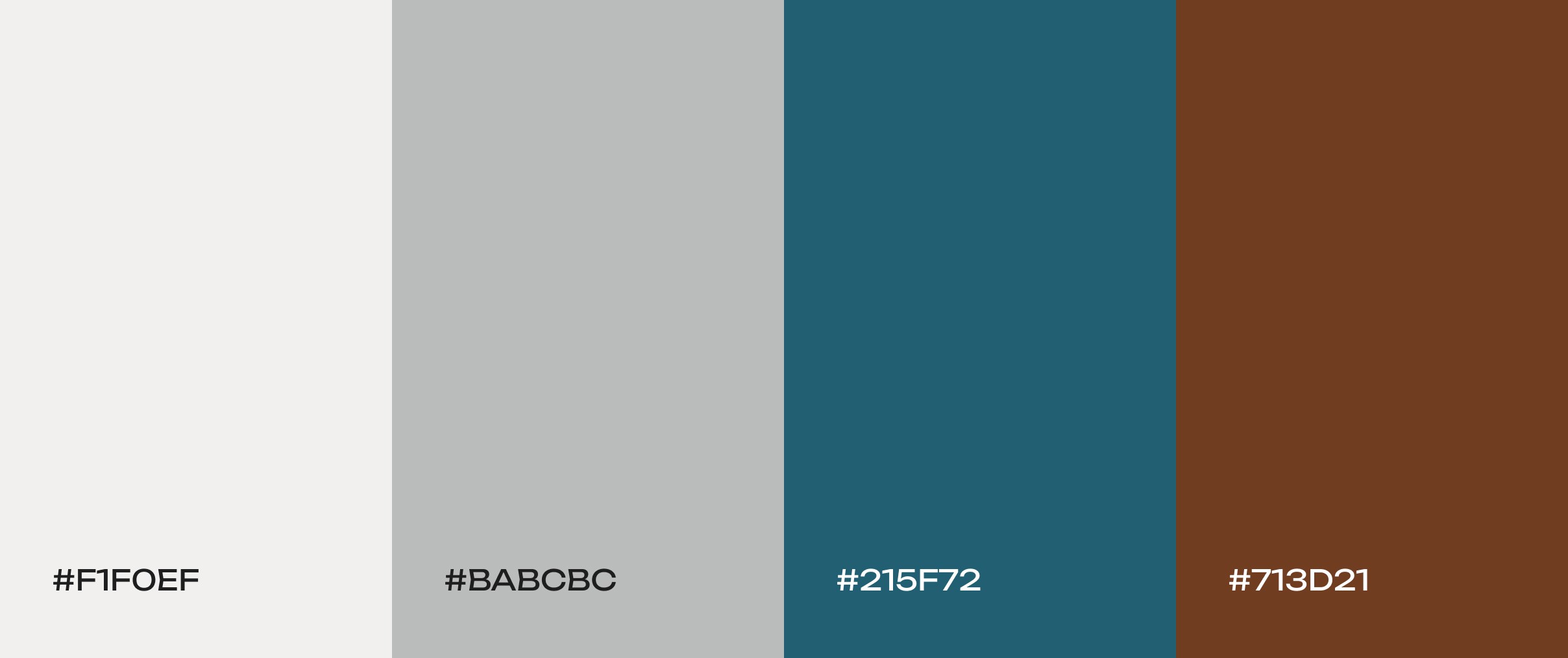
Yacht club
Off-white tones with blue and warm brown accents. This balanced neutral palette feels calm and earthy. The warmth of brown grounds the scheme, while the deep blue adds a hint of vibrancy and coolness. It evokes a relaxed, nautical elegance – perfect for wellness apps, gardening blogs, or any nature-themed brand.
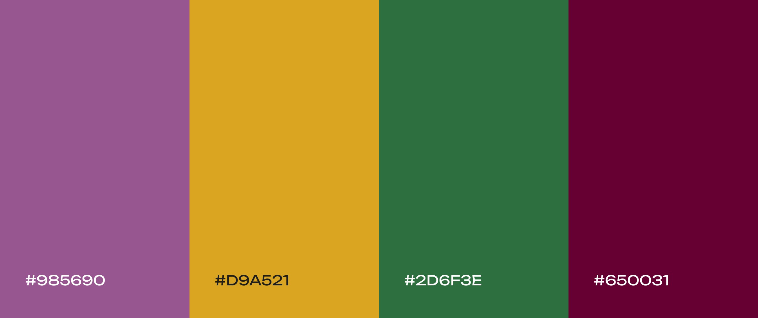
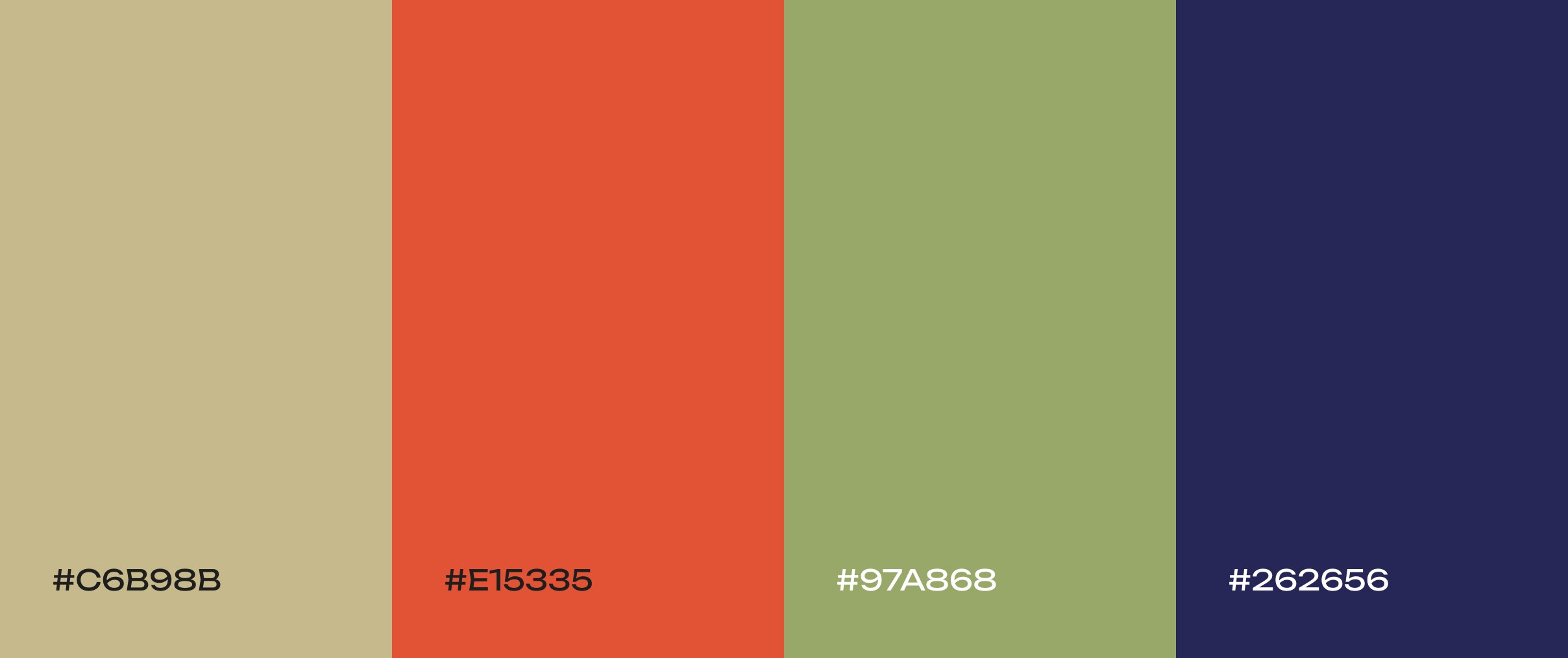
Autumn orchard
Deep plum, goldenrod yellow, and forest green. Like a crisp orchard scene, this palette feels warm and comforting. The rich burgundy and gold tones suggest coziness, making it a great fit for food blogs, natural product sites, or autumn-themed content.
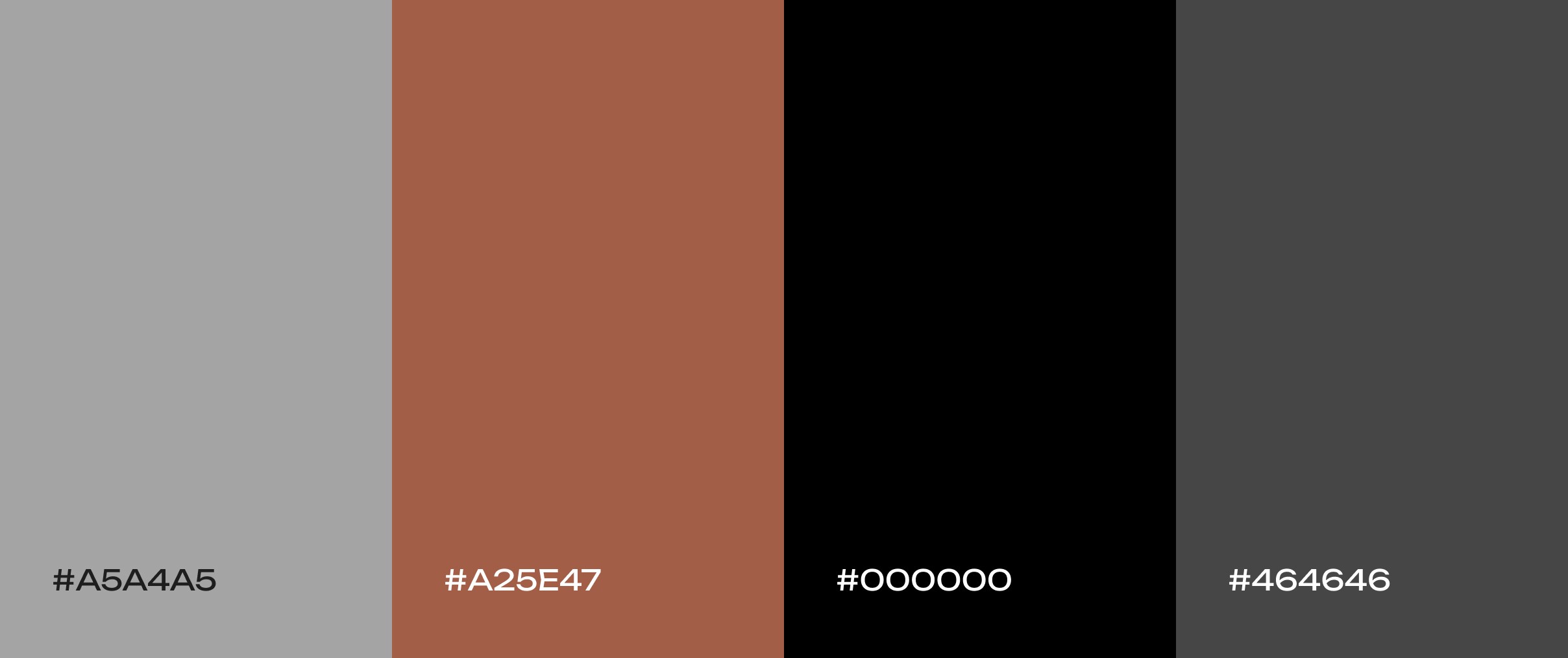
Urban loft
Industrial-chic shades of concrete gray, exposed brick red, and crisp black. This modern, sophisticated palette feels strong and minimalist. It’s a great match for real estate websites, architecture firms, or modern furniture brands that want an on-trend, upscale look.
Desert mirage
Sandy beige, terracotta, and sage green. This warm, grounding mix captures the calm, earthy beauty of desert landscapes. It’s great for wellness brands, travel sites, home decor, or any project that wants to evoke tranquility, resilience, and a touch of Southwestern charm.
Under the moonlight
A soothing range from soft periwinkle to deep blue. These calming night-sky hues create an atmosphere of wonder and tranquility. This palette is ideal for sleep or meditation apps, as it gently promotes calm and curiosity (for example, in astronomy or educational content).
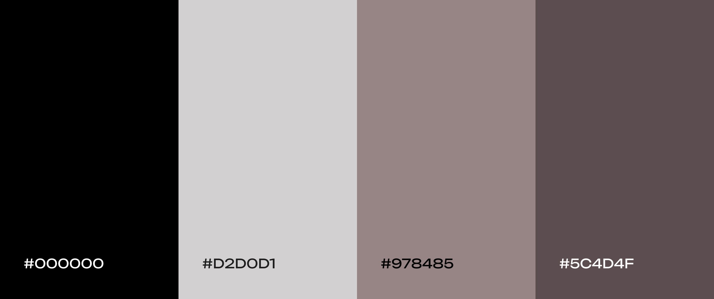
Gothic noir
A moody scheme of black, gray, and taupe. This refined neutral palette combines dark and light neutrals to create a sophisticated, slightly dramatic look. The high-contrast between light and dark shades gives visual interest while remaining elegant – ideal for design studios, fashion, or photography sites that want a sleek, modern edge.
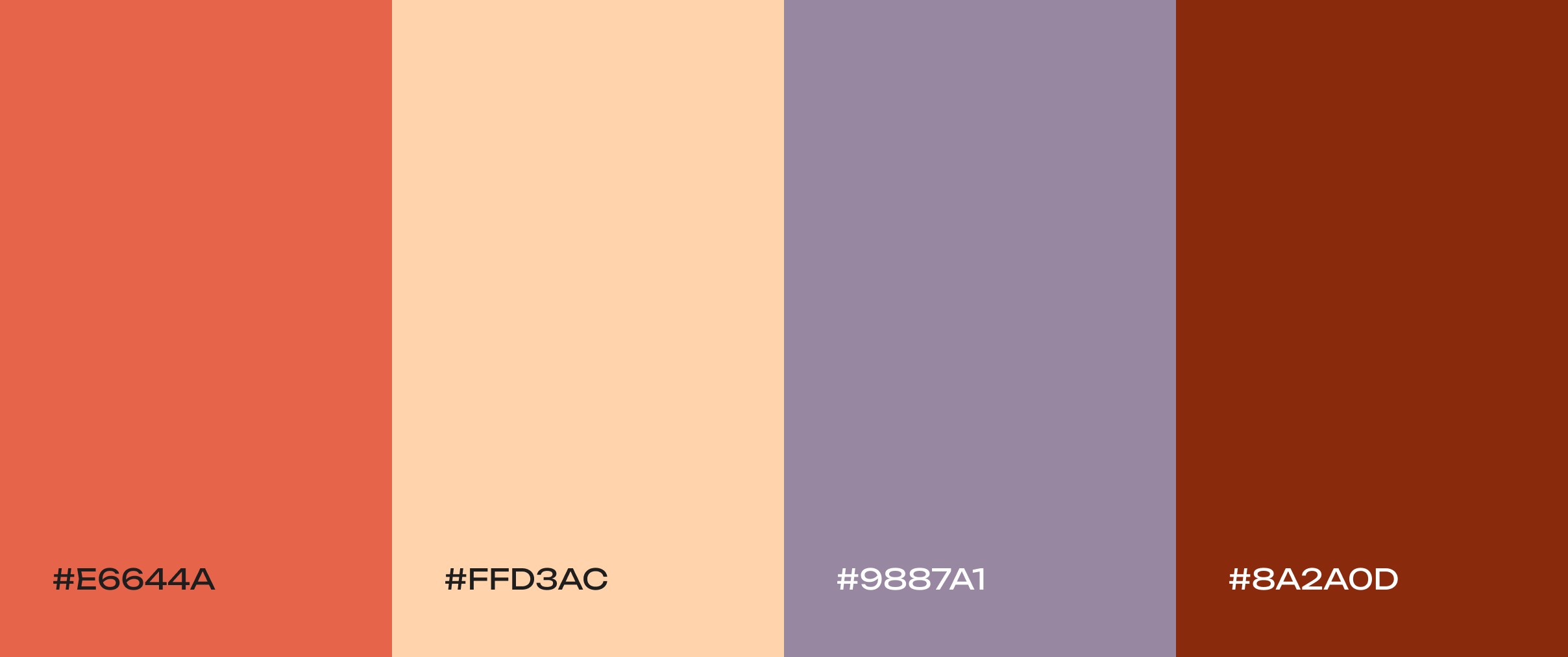
Tuscan sunset
An earthy yet elegant scheme of warm terracotta, soft peach, and dusty lavender. This palette balances warmth and sophistication – think sun-drenched Italian vistas. It’s ideal for travel, food, or lifestyle sites that want a cozy, natural feel without feeling heavy.
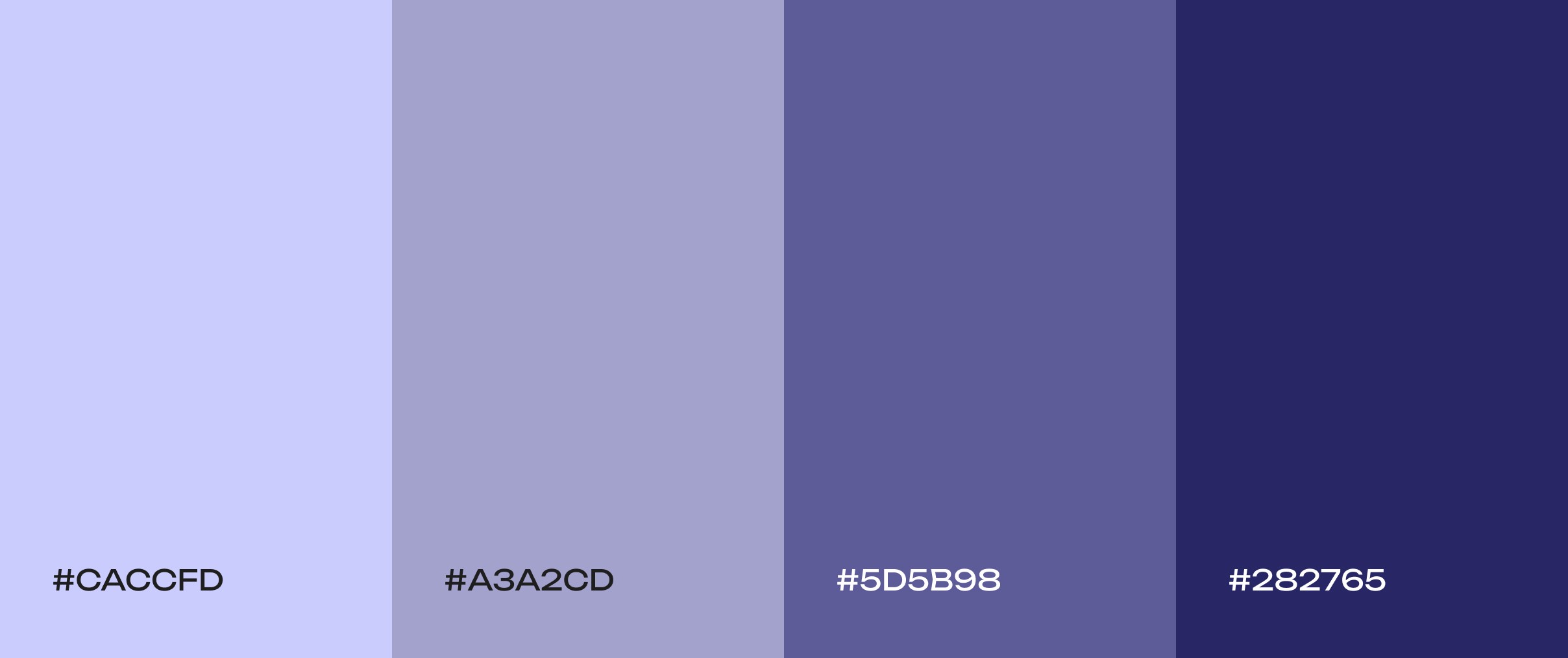
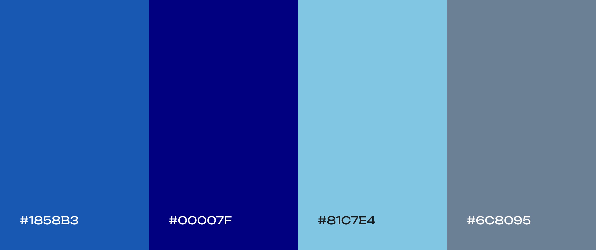
Cobalt sky
A sleek range from bright cobalt to deep navy. This monochromatic blue scheme “feels both credible and energetic, like twilight shifting into night.” It’s an excellent choice for tech platforms or dark-mode interfaces that want to balance trust and modern flair.
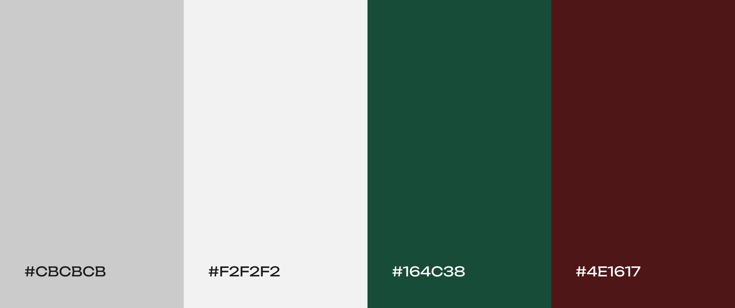
Quite clear
Cool gray paired with deep green and rich brown. This subdued trio “evoke[s] a sense of professionalism and sophistication.” The result is a palette that feels trustworthy and grounded, making it great for corporate sites, finance/banking apps, or professional services.
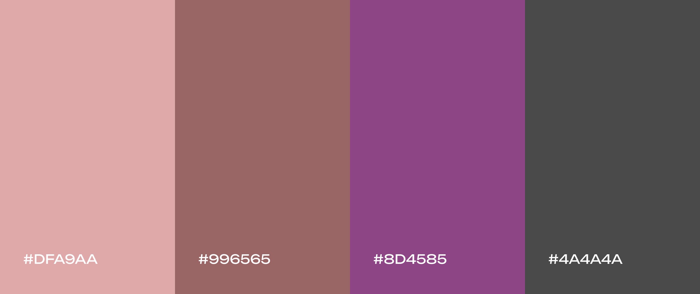
Evening rose
Soft, romantic hues of dusty rose, muted mauve, and plum. This twilight-inspired mix feels grounded yet charming, perfect for fashion, weddings, or wellness brands seeking a timeless, elegant vibe.
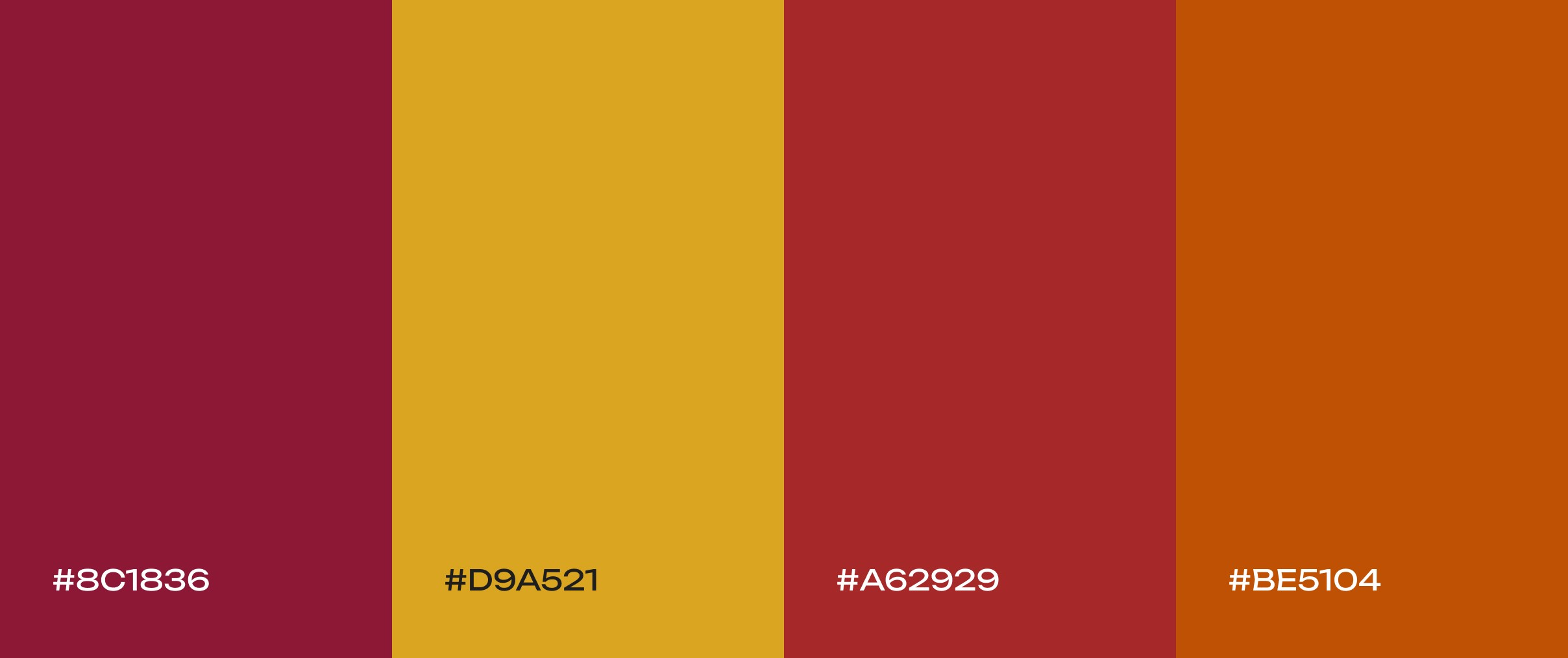
Harvest moon
Deep burgundy, mustard yellow, and earthy brown. This cozy fall palette evokes the feeling of a crisp autumn day. The warm, inviting tones add seasonal charm – perfect for home and lifestyle brands, food or recipe sites, and any project that wants a touch of harvest warmth.
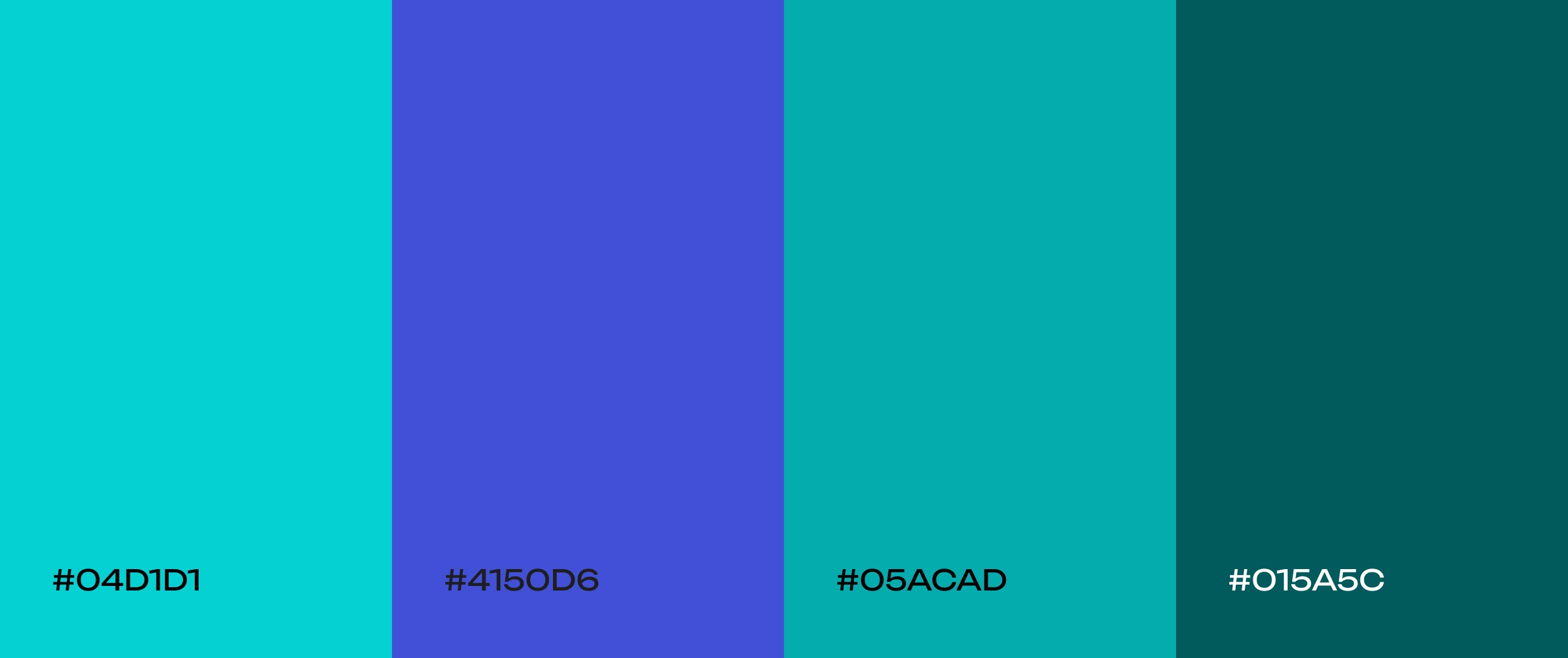
Ocean tide
A monochromatic blue-green palette (think seafoam to deep teal). These colors capture the essence of gentle ocean waves. They bring a sense of peace and tranquility to any UI, making them perfect for apps or sites in wellness, spa, or any context that wants a calming, marine-inspired vibe.
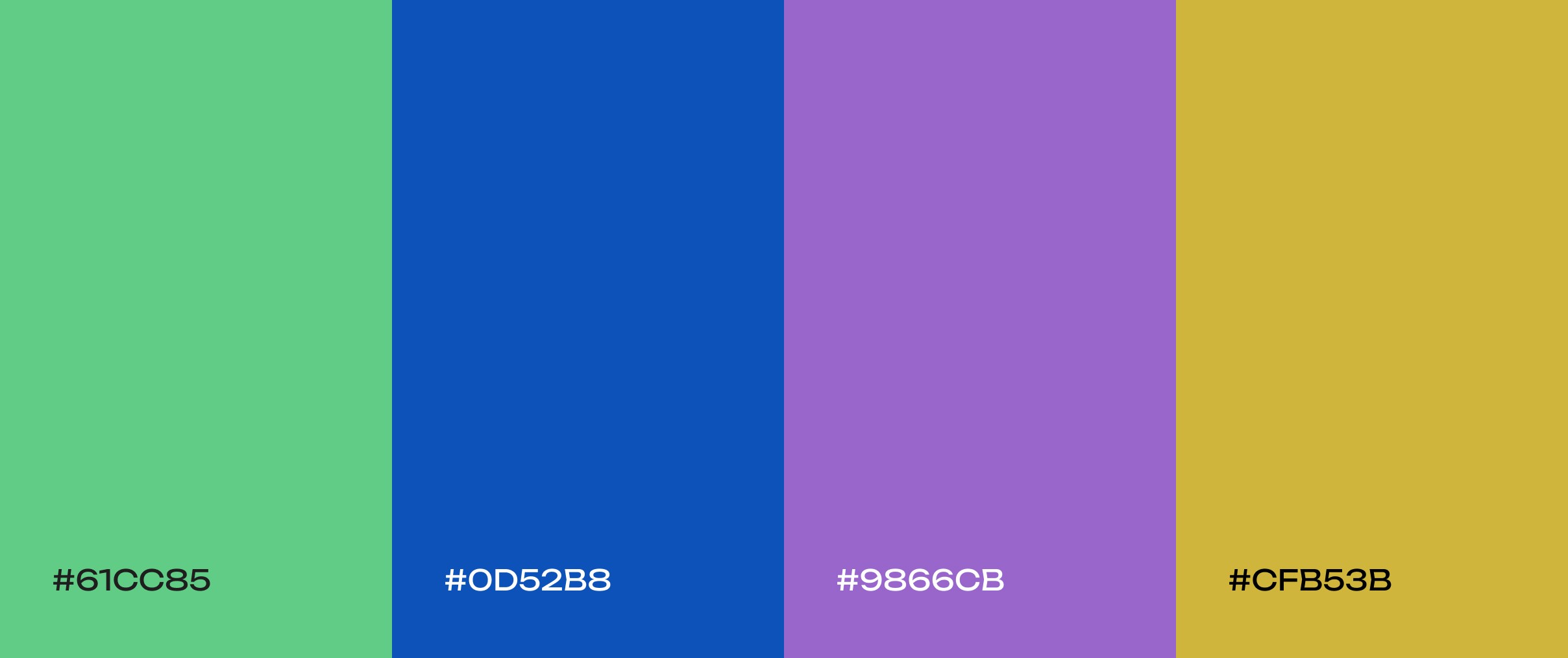
Jewel box
Rich, opulent tones of sapphire blue, emerald green, and amethyst purple. This luminous jewel-tone palette feels dramatic and luxurious, making a bold statement. It’s well suited for fashion houses, art galleries, or luxury brands that want to convey richness and creativity.
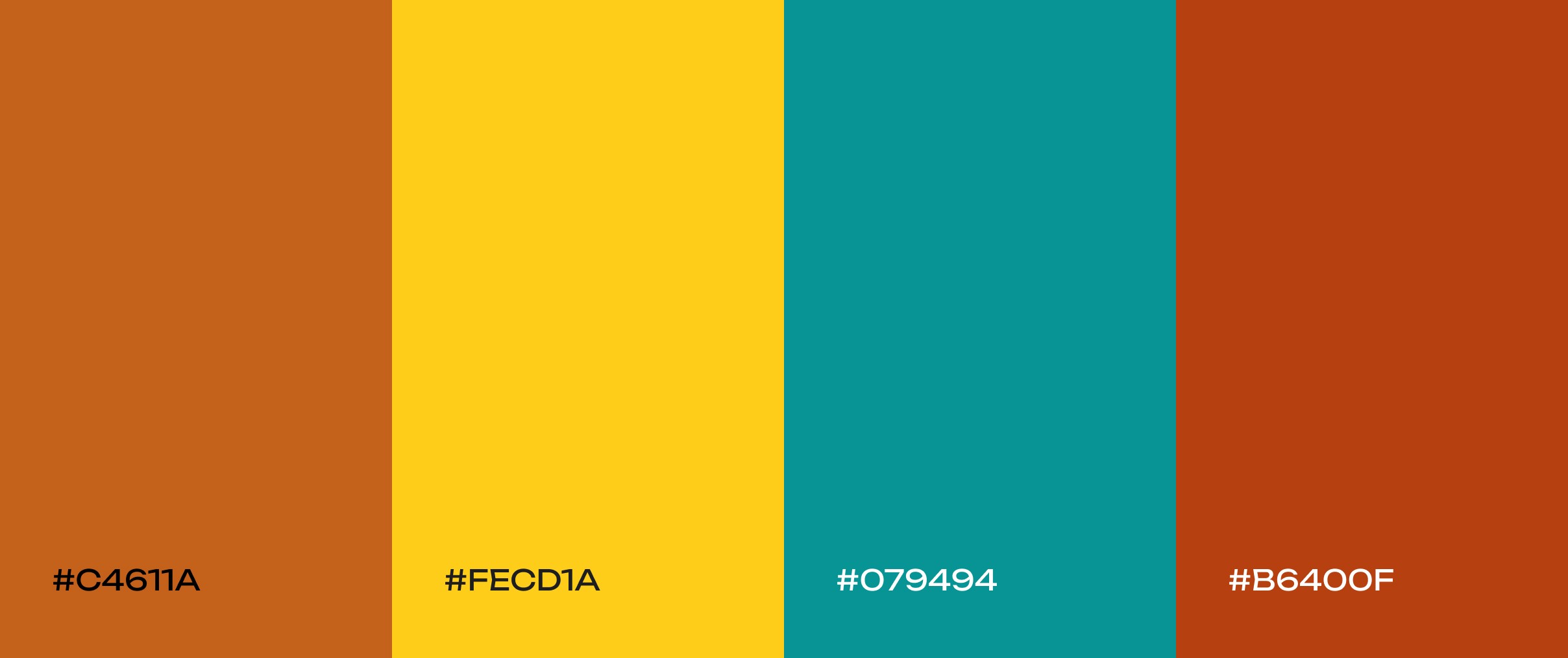
Retro sunset
A nostalgic ’70s-inspired palette of burnt orange, mustard yellow, and teal. These warm, earthy tones with a pop of cool contrast are great for vintage-inspired brands or creative portfolios. The palette feels retro and playful, evoking nostalgia and warmth.
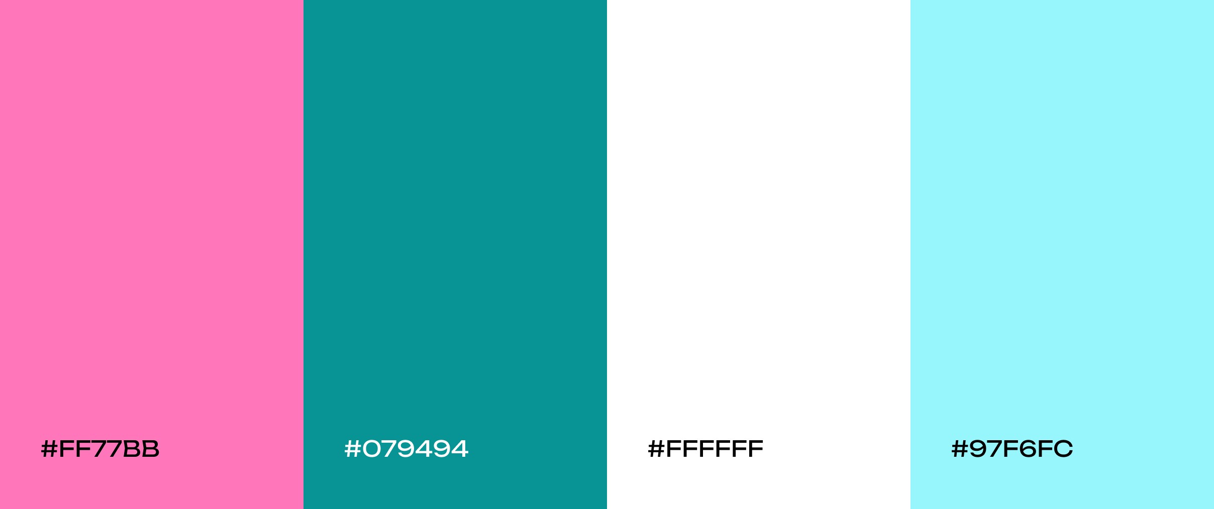
Bubblegum pop
Bright bubblegum pink, vibrant teal, and crisp white. This unapologetically fun and energetic scheme “practically jumps off the screen.” It’s ideal for brands that want a modern look with a touch of ‘90s nostalgia – for example, kids’ products, lifestyle brands, or anything aiming to feel youthful and lively.
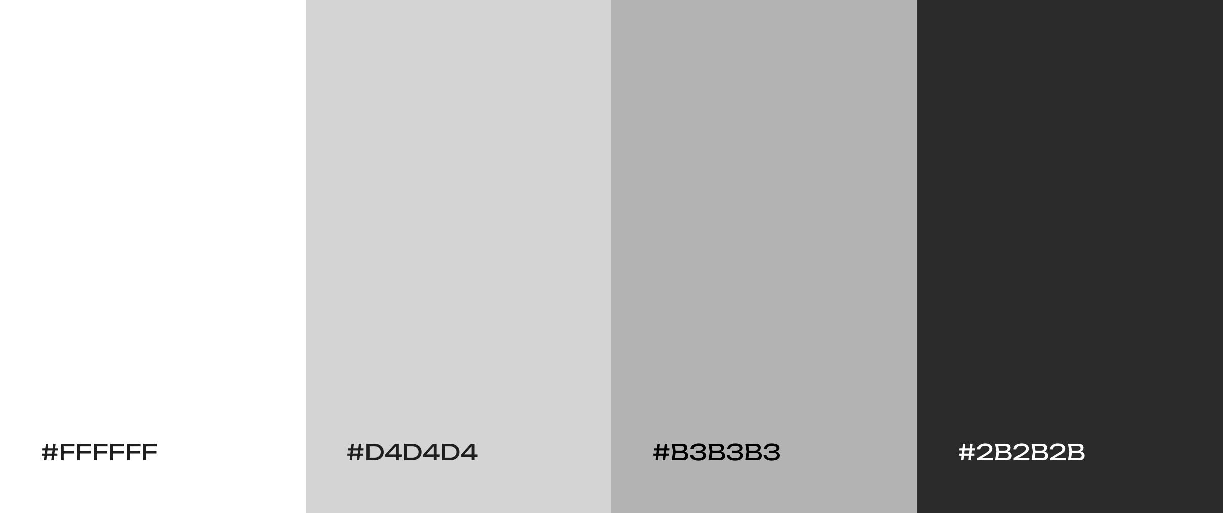
Salt and pepper
A clean, neutral mix of whites and grays. This modern palette has a minimalist, professional vibe. It’s perfect for productivity apps, e-commerce sites, or any interface that wants the products or content to take center stage against a subtle backdrop.
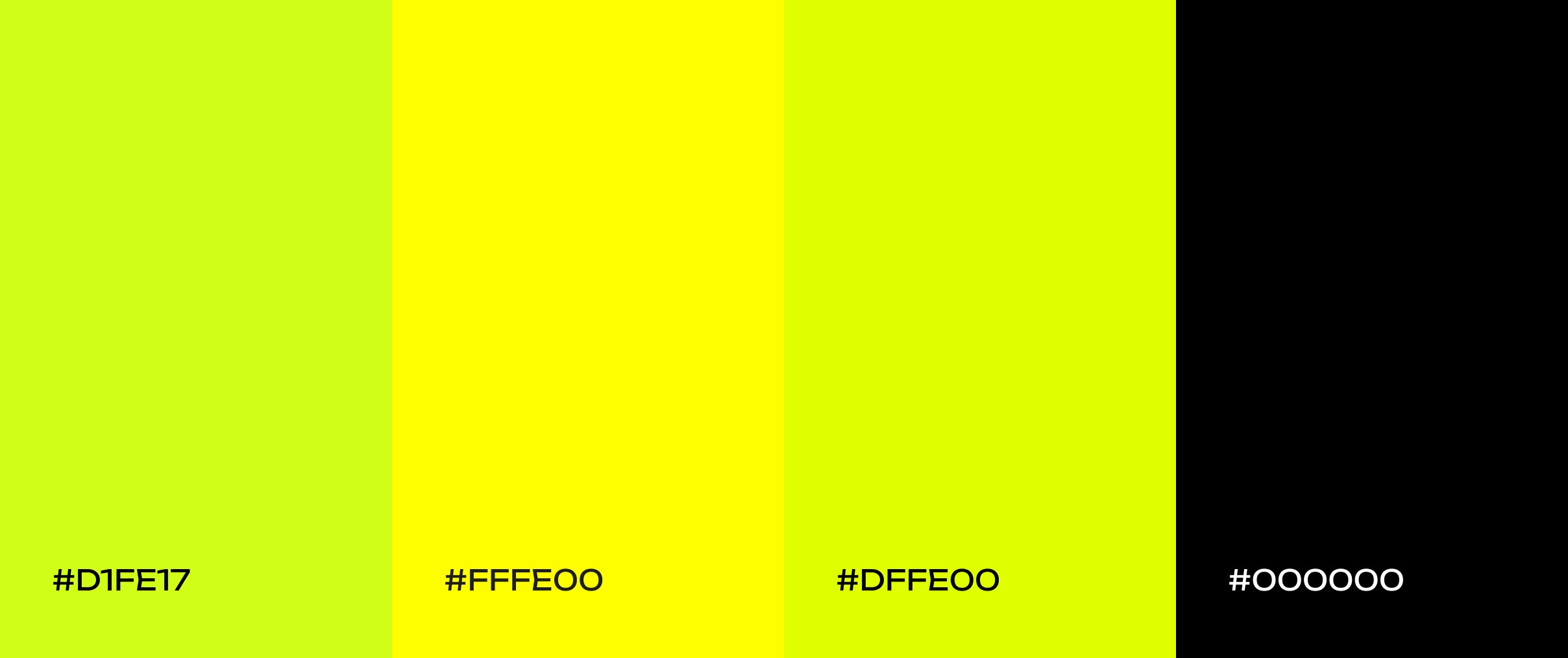
Electric kiwi
A high-voltage mix of brilliant lime green and sharp tangy yellow. These neon-like colors create a dynamic, stimulating feel – think energy drinks or fitness apps. The palette is impossible to ignore, giving any design a bright, fun edge.
How to Choose a Palette for Your Website?
Selecting the right color palette for a website goes far beyond simply choosing shades that look appealing together – it is a careful balance of strategy, psychology, and user experience. Each color carries meaning and evokes specific emotions, influencing how visitors interpret your brand, navigate your content, and interact with your product. The palette you choose can establish trust, highlight important actions, convey the personality of your brand, and even affect users’ moods and decisions. In short, color is a silent communicator that shapes both perception and behavior, making it one of the most powerful tools in web design when applied thoughtfully.
Identify your base color
The first step is to identify your brand’s base color or signature tones. Many established brands are defined by one or two key colors, like Coca-Cola’s red or Starbucks’ green, which convey their core identity instantly. Your base color sets the mood for the entire palette, whether you want to inspire trust, energy, calm, or creativity. For example, blue typically evokes reliability and professionalism, green communicates growth and balance, while warmer hues like orange or coral can feel energetic and approachable.

Yellow-and-black website case study for Tanasov Group, designed and developed by Codeska. Click to see more.
Expand using color theory
Once a base is established, the color wheel becomes an indispensable tool for expanding the palette while maintaining harmony. Using principles of color theory, designers can select complementary colors for striking contrast or choose analogous colors to create a softer, more cohesive feel. Triadic or tetradic arrangements allow for more dynamic and expressive palettes without sacrificing balance. The key is to ensure that all colors relate to one another intentionally, reinforcing the mood you want to communicate and supporting the hierarchy of information on the page.
Prioritize legibility and accessibility
Even the most visually appealing palette can fail if text and interface elements are difficult to read. Effective contrast between background and foreground colors ensures that content is clear for all users, including those with visual impairments. Subtle adjustments, like using dark gray instead of pure black for text or slightly off-white backgrounds instead of stark white, can reduce eye strain while maintaining clarity. Tools and standards such as WCAG guidelines can help verify that your choices meet accessibility requirements, ensuring that the design is both beautiful and functional.
Maintain brand consistency
Neutral tones can act as stabilizers, supporting brighter accent colors and helping key elements stand out without overwhelming the user. A consistent palette reinforces visual hierarchy, directs attention to calls to action, and strengthens brand recognition. It’s not just about matching colors; it’s about creating a coherent visual language that guides users intuitively through the interface.
Test and refine
A palette may look perfect in isolation but behave differently when applied to real content, on various devices, or under different lighting conditions. Reviewing the colors in context, gathering feedback from colleagues or users, and adjusting as necessary ensures that the palette works in practice, not just in theory. Refining hues, saturation, or combinations can make a significant difference, transforming a palette from good to exceptional.
Final Thoughts
Color is one of the most powerful tools in a designer’s arsenal. When used thoughtfully, it can do much more than make a website look attractive — it can guide user behavior, highlight key actions, evoke specific emotions, and reinforce a brand’s identity. Understanding the fundamentals, such as the color wheel and harmony rules, provides a solid framework for making these choices. These principles help designers create palettes that are balanced, accessible, and visually engaging, ensuring that every element on a page feels intentional.
Inspiration from curated color palettes, like the ones featured above, allows teams to stay current with design trends while experimenting with combinations that bring personality and energy to their projects. As experts at Figma emphasize, selecting the right color combinations is critical for building interfaces that not only stand out but also communicate the brand’s values and message effectively.
With a strong grasp of color theory, a clear strategy, and iterative testing, any team – including ours at Codeska – can craft web designs that truly resonate with users. By combining creativity with strategy, you can create interfaces that are not only visually striking but also functional, cohesive, and memorable. In 2026 and beyond, thoughtful color choices will continue to be a defining factor in what makes digital experiences feel polished, professional, and engaging.